
What Happens If You Replace Your Entire Product With a Chat Interface

Some products are experimenting with going all-in on chat. No UI. No feature pages. Just a box and a blinking cursor.
It sounds clean. It sounds powerful. It's actually a step backwards for most users.
Here's why.
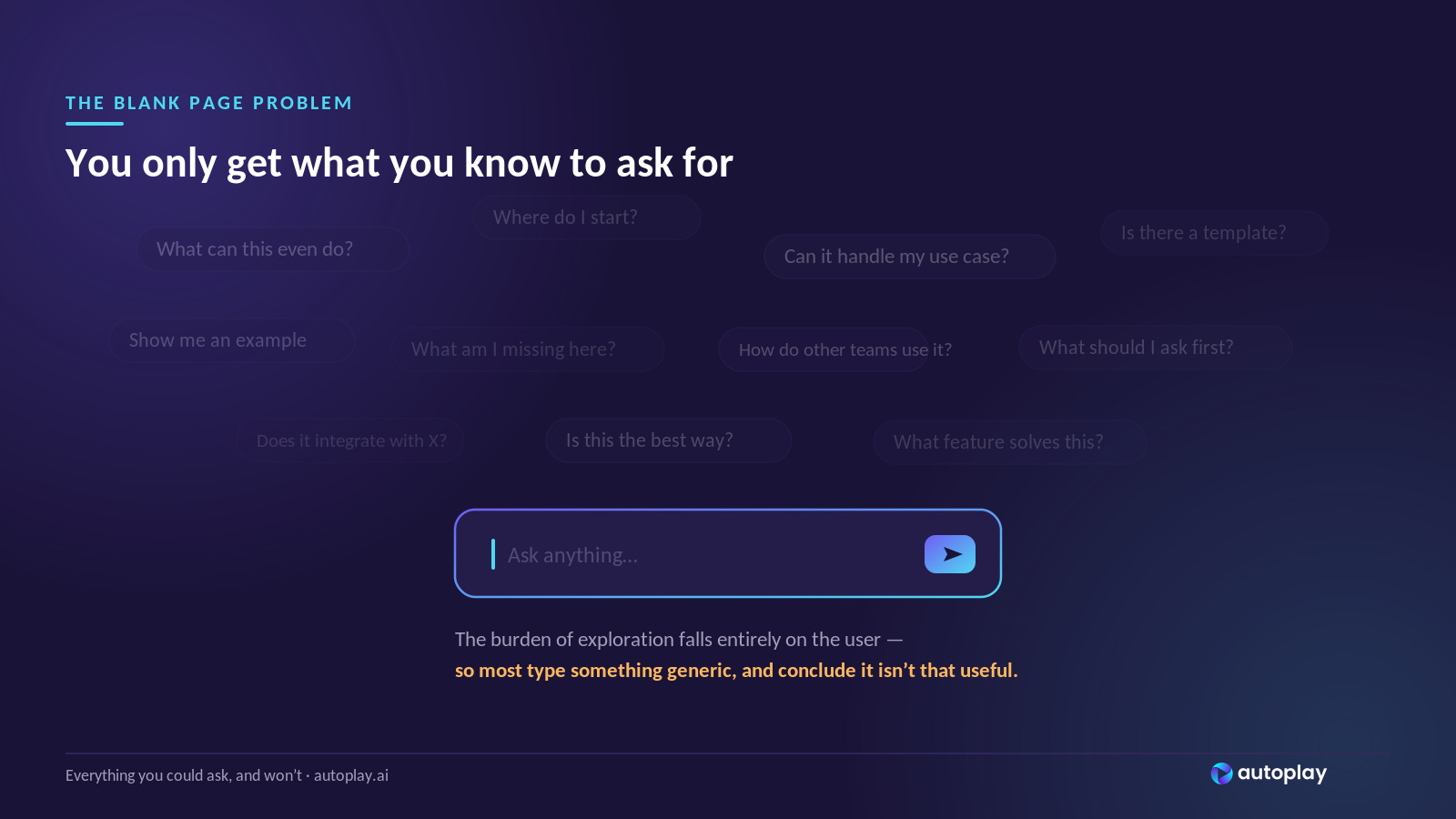
The blank page problem
A chat interface puts the entire burden of exploration on the user.
To get value, you have to know what to ask. And most users - especially new ones - don't.
This isn't a failure of intelligence. It's a failure of context. When someone opens your product for the first time, they have a vague goal and almost no mental model of what your product can actually do. A traditional UI scaffolds that gap.
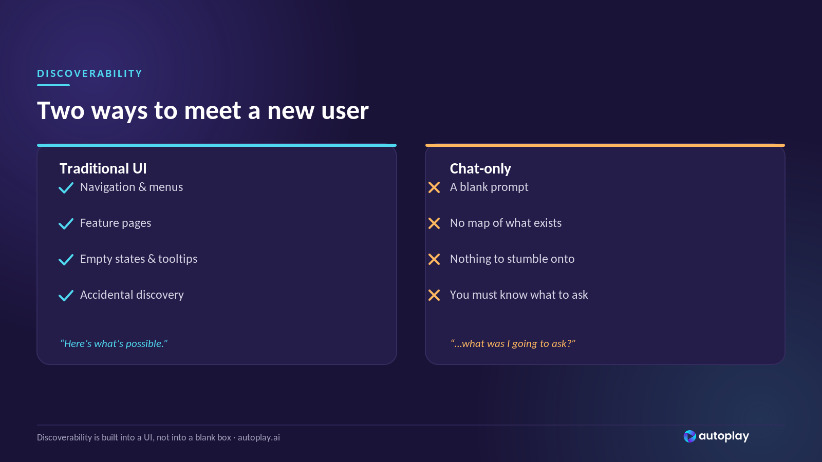
Navigation, feature pages, empty states, tooltips - all of it quietly communicates: here's what exists, here's what's possible, here's where to start.
A blank chat box communicates none of that.
"Users don't know what they don't know" gets exponentially worse
In a traditional UI, discoverability is built into the surface.
A user stumbles across a feature because it's sitting in a menu. They click something they didn't plan to click. That accidental discovery has real value - it's often how users find the thing that makes them stick.
In a chat-only interface, nothing is stumbled across. You get exactly what you ask for, and nothing else.
The user who asks the right questions gets enormous value. The user who doesn't - which is most users - gets a fraction of what the product can do and eventually leaves.
The irony is that the more powerful the product, the worse this problem gets.
More capabilities mean more things a user could ask for and won't, because they don't know how to ask.
Onboarding doesn't get easier. It breaks.
Traditional onboarding exists to close the gap between what a user knows and what a product can do. It's a guided introduction to possibility.
In a chat-only world, that gap doesn't shrink - it becomes invisible.
There's no tour to take, no checklist to complete, no empty state nudging you toward your first action. Just a prompt.
Most users will type something generic, get a generic answer, and conclude the product isn't that useful. Not because it isn't - but because nothing showed them where to look.
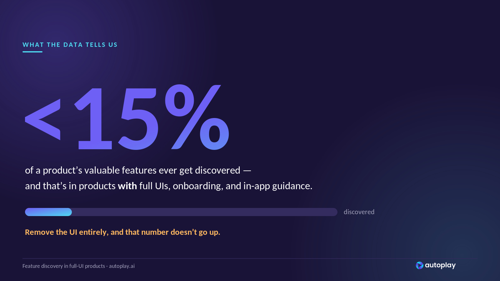
What the data already tells us
Users discover less than 15% of a product's valuable features on average. That number was measured in products with full UIs, onboarding flows, and in-app guidance.
Remove the UI entirely, and that number doesn't go up.
The fix isn't a better chat interface
A smarter LLM doesn't solve this. A better prompt placeholder doesn't solve this. The problem isn't the quality of answers - it's that users aren't asking the right questions in the first place.
The fix is proactive guidance. Instead of waiting for users to ask, the product needs to know where the user is, what they've done, and what they should do next - and say it first.
Chat interfaces that succeed will be the ones that don't wait. They'll watch behavior, detect the gaps, and reach out before the user realizes they're stuck.
That's not a chat interface anymore.
That's an onboarding layer built on top of one.